Thursday, 18 August 2011

Tuesday, 16 August 2011

Starting to organise my ideas coherently!


Oh, one initial concept!

This is just a quick sample of a 10-minute design I played around with (it was originally an image of a mossy tree that I tilted, saturated, and then manipulated it for a bit). I am not a huge fan of the repeat, it is too symmetrical for my taste right now!

That awkward moment when...

I am currently facing the awkward position of utter inspiration, yet my mind is buzzing, so I am unable to coherently apply what I want to do, to what I need to do!

Anyone understand??

Ugh, I am going to use this post to purge all of my ideas for my digital print class... the brief is to come up with a collection of Spring/Summer '12 fabrics that will be presented to Charles Parsons, and then they will select some designs to purchase (for a whopping 400 dollars each!).

So... no pressure...

This is exactly what I scribbled down in my journal to describe what kind of thing I am going for: "I want to create highly-saturated, altered-hue photographs with graphic design/vector elements, and buildings, crossing into nature." If anyone can decipher this for me, let me know?

This resort collection by Carven features large-scale, no-repeat digital designs, that are almost abstract. I really love this (mostly because I can't really be bothered using cliche 'double-reflections' etc to create repeats), and from here my ideas have come forth.

This image above is a perfect example of changing the hues to create less-than natural images.

The above image is taken from the International Space Station, and depicts a series of crops. I just love the geometry in this, and how the colours already seem unnatural, without the need to saturate or alter the hues.

This is an example of the graphics/vectors elements I want to add to images of nature, or where it just seems completely juxtaposed.

The above images are further examples of nature-meets-man in a visual point of view. I want to also take the direction of having man-made structures like buildings/statues etc and chuck some nature into them! I just love this mix of elements - it makes me all excited and really want to start designing!! Might have to borrow my flat-mate's DSLR to get some images worthy of manipulation.

This is the type of extreme saturation I would seriously love to experiment with!
And again - I just love this, it reminds me of Alice in Wonderland, just another dimension, a separate universe almost.

I really want to also tie in a few 3D-looking elements if I have the time to experiment and mess around with these ideas a bit more!

Just another exciting example of things that are inspiring me right now! I love this screen-print. It just makes me stop and stare.

Last image: This one is something that I would like to bring in from the nature perspective - lichen and mosses etc, these create such amazing patterns and details that I would love to incorporate into my work. (Although at the point, my ideas are everywhere, and I really need to cut them down and be a bit more realistic with where I am at!).

So this is what my mind would look like if you could see it. It is also mixed with a further array of emotions, questions and ideas.

x

Friday, 5 August 2011

I have finally decided what I am going to focus my screen printing on! I have thought more in-depth about the geometric concept, and how and where I could apply it to somewhere where it could be commercially produced.
So... I had the theme of children's rooms and the textiles used in them going through my head, and it got me thinking: newborns.
I am going to use the way that babies' eyesight develops from birth up to about 6 months to create my prints.

For about a week after birth, babies can not really see colour, mostly black/white/grey, and anything with high contrast, and then from there the babies develop the ability to perceive colour - generally it is mostly high contrasting colours like red and green, and then later blues, pastels, along with the handy tool of depth perception.

So with this I will create a range of fabric designs that can be used in the room of the baby at different stages to create the right stimulus.

----------------------

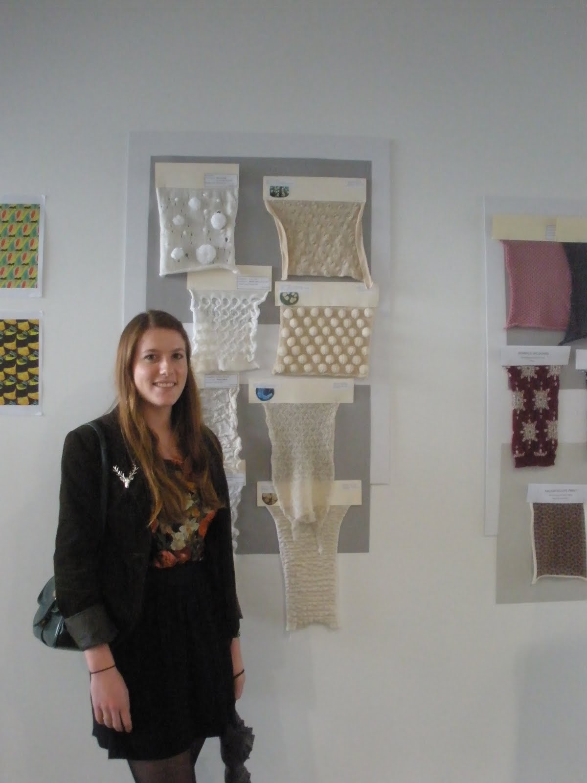
This morning at uni I was surprised to find some of my knitwear swatches displayed on the fashion and textile floor at my uni!
(My swatches are on the right column - inspired by bacteria!)

My cable-look fair-ilse designs.

Today my flatmate and I decided we needed to exercise a bit more, so we climbed Big King Reserve and watched the sun set (unintentionally)... And then we went to Burger King = fail. BUT I am going to the gym in the morning so it is okay. Ish. Haha.
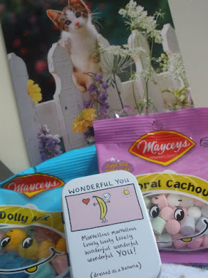
My mum sent me a mini care package today to cheer me up about India! Cute little kitten card, some good ol' kiwi lollies, some socks and some mints. Happy :)
Dolly Mix!

Looking forward to screen-printing now that I know what I am focusing on. Now I just have to sort out my digital design.... ugh.

x

Wednesday, 3 August 2011

Yummmmmmm.

Vegan Nutella.

This looks too amazing.
Find the recipe here on Food Coma.

Mmmm Mmm.

Screen Printing Inspiration

Just an update on my previous post, I am not going to be going to India in September, because University was too difficult to work around, but God has managed to outwork a better outcome! I am now heavily considering moving to Kolkata for a year to work for Freeset in February 2012! I am beyond excited at this prospect, as my heart just broke thinking I wouldn't get to India at all!

Now that I am remaining in New Zealand for the time being, I am having to refocus on my final semester - we are working on our Digital and Screen Printing media, as well as learning Illustrator and about Design Communication, and I am pretty happy that we are watching movies and studying them in theory! Good ones too: The Devil Wears Prada, Roman Holiday, Dracula, and Memoirs of a Geisha!

So I have begun to gather some images of inspiration for my Digital/Screen Printing/Illustrator classes to use as my stepping stones to get some designs flowing!

Here are my Screen-Printing images:

From this image above, I have found that I am quite inspired by the geometrical aspect to it, which is what I am using to spurn out further images related to it...

(Two separate links btw)
As you can see in this collection, there is a glorious amount of geometrical imagery and patterns going on, which look fantastic!

This is a nice colour palate, but I am wondering whether it will be best for what I am going for, as many S/S collections are brighter colours - although this is quite a soft, warm colour palate, which reminds me of quiet evenings in with a friend or two, chilling out with a nice dinner and wine, after a sun-blasted day. Oh Lordy, my imagery is embarrassing.

Image from Design*Sponge

I love this image above - it reminds me of the vibrant colours of India (I know, I am obsessed!). It's cool, because in our screen printing class, we have access to foils, so I can add metallic accents to my design (whatever it will be), so I can have elements similar to the above two images.
Patrick Dan featured on Design*Sponge

I saw this image on Tumblr, and it made me really want to incorporate flags/bunting into my design! It is an interesting concept, and I am thinking that if I am to focus on this idea, I would design for a wallpaper banner that runs along the wall horizontally (if you get what I mean?).

Another image on Tumblr, and this one has inspired me beyond the initial concept of a wallpaper banner featuring bunting, but if I am to pursue this idea, I think that I will add designs within the flags, similar to the above two images.

And this image I just love - I love the flags in the background, with the overlaying of a hand-drawn design - simple three-colour palate - perfect for screen printing!

So I will see how I can develop and intertwine the two concepts of geometrical designs, as well as the flags/bunting. I have to also decide what I will design for - be it S/S swimsuit, or a fabric for designers to use to create garments... or maybe even a bed-spread, a beach towel.... the possibilities are almost endless. The boundaries are only what I can screen-print onto successfully.

Quite a long post, but my way of being able to purge out some of my ideas and sort them out a bit (and now you might have an insight into my mind and how I process ideas and concepts!).

Hope winter is treating you well (down here in the Southern Hemisphere), and that the Northern Hemisphere gets ready for when we claim summer back! Not long now... haha.

Ta-ta for now.
x